Wendingen by El Lissitzky, 1921
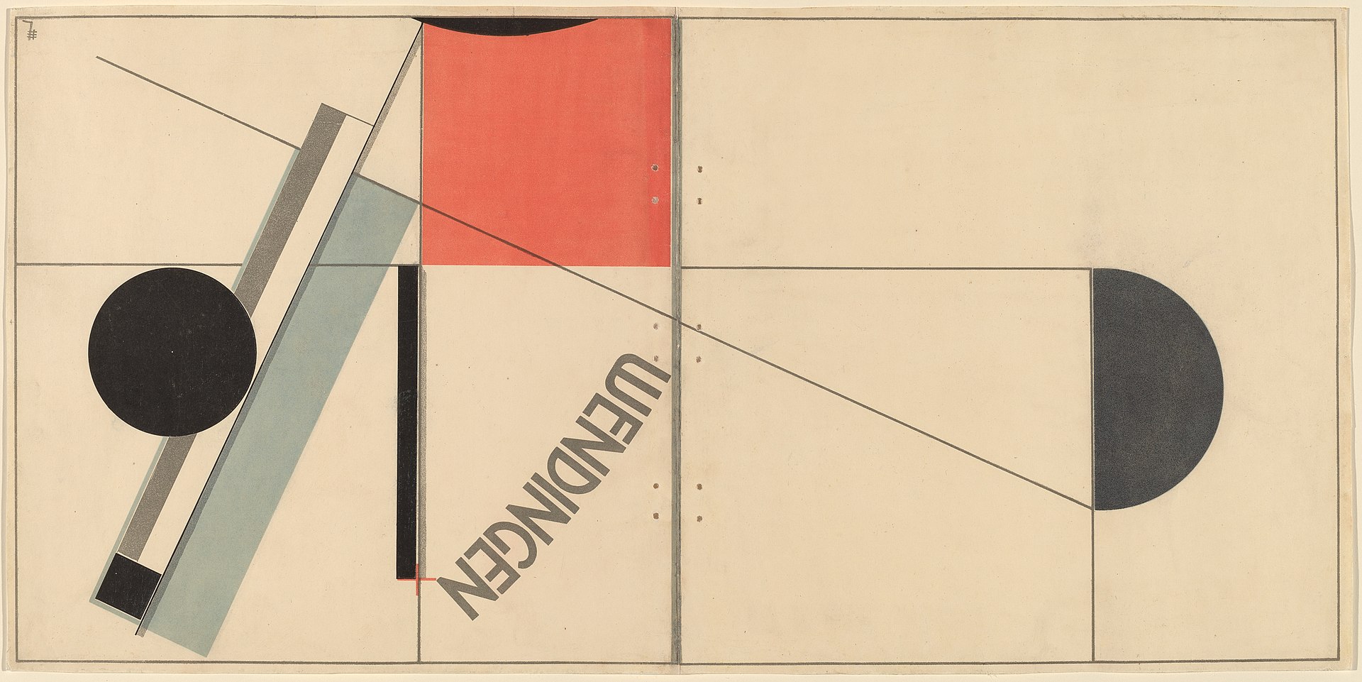
This was a cover for Wendingen, a Dutch design magazine that apparently invited a rotating cast of outside artists to design an issue. The sideways lettering was part of a bigger push at the time to make the printed type itself look modern, instead of just decorating around it.
Erisava: This looks like a cover trying hard to seem modern. What's your take?
No comments yet. Be the first to share your thoughts!